Five Great 3DS Max Features

Creating 3D models may be tricky, but I thought I should share some of the more useful modifiers available inside of 3D Studio Max.

One: Symmetry Modifiersym

If a model is going to be symmetrical it would be a huge paint to model both halves organically, trying to ensure it is a perfect reflection on both sides. Typically in most 3D package software’s the user would model half of the model, duplicate, and mirror to create the flipped reflection, and then finally weld the model back together.

symdemo

3D Studio Max offers, a unique workflow that you can work with in real time.  Using the symmetry modifier, you can work on half of the model and see the result on the other half the model in real time.  When the work is done you can collapse the modifier stack, applying the changes to the base mesh.

Two: Shell Modifier

An extremely useful way to add dimensions to any polygon  shellsurface. The Modifier will extrude out from a flat shape. These extrusions can be set from either the inside or outside
of the desired face. I use this tool most often when I need to quickly extrude and add dimension to a complex flat shape.

Benddemo

Three: Bend Modifier

This tool is also great for doing just that, bending!  I most often bend
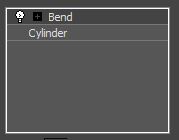
use this when I have complex geometry that requires accurate bends.  What I mean by this is that it the Bend Modifier allows you to set the Angle, Direction, Axis, and even threshold limits allowing you to create natural bends without kinks.  The user just has to keep in mind that the geometry will need to require the appropriate amount of edges in order for the mesh to bend realistically.

shelldemo

Four: Slice Plane

Under the Edit Geometry panel, you can find the Slice Plane Tool.  It is a very powerful tools sliceplane
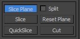
as it allows you to slice through your model across a plane. regardless of geometry, and edge loops it slices across the entirety of your topology.

Just be warned, that if used inappropriately it can lead to a messy mesh, with poor surface topology.

sliceplane demo

Five: Freeform>PolyDraw>Optimize

optimize

This is probably my favourite modelling tool in 3D Studio Max. It allows us to quickly weld vertices together on a model, cleaning up bad topology in a process that 3Ds refers to as Optimizing.

Using the Ctrl Shift and Alt keys the user can clean up their topology with unprecedented speed.optimizedemo

Hopefully you are able to find these tools as useful as I do.

Five Great 3DS Max Features

Avoiding pitfalls of using multimedia in elearning

Many successful elearning courses use different types of media (ie: text, images, sound, video) simultaneously to generate interest and direct the learner’s attention around the content. However, using several forms of media together can just as easily create problems that counteract learner comprehension and make your content more difficult to absorb.
Two cognitive science principles that can help you understand when different types of media may conflict with each other are the Split-Attention Effect and the Redundancy Principle.


The Split-Attention Effect

The split-attention effect is a common problem that occurs when two sources of related information are presented separately – most often in the form of a diagram or other graphic and its explanation when the two are presented on different parts of the screen. This causes the learner to have to split their attention between the two sources, which can cause them to lose some of the information from each source as they try to process both at the same time, or switch their attention between the two. The effect is worse when there is a temporal component (ie: video) when information can go by while the learner’s attention is on a different part of the screen.
The best way to design for this situation is to integrate the textual component into the graphic or video it’s explaining so that the learner doesn’t have to process the information separately, or replace the text with properly synced audio. If the different types of media are integrated properly, that will cut down on the cognitive load required from the learner.


The Redundancy Principle

When using multiple forms of media, another thing to avoid is presenting the same information in multiple different mediums. A frequently occurring example is the use of text to explain a graphic at the same time there is narration doing the same thing. Learners may try to compare the information coming from different formats, and have trouble focusing when doing so. Also, the learners’ attention tends to gravitate towards text as it requires the most effort to process, which can cause them to miss information coming from the graphics or the audio.
Ideally, if the content can be presented with graphics and audio, you can do away with text altogether. Always keep in mind the cognitive demands you are placing on the learner with the content you are presenting, and streamline as much of your elearning as possible to reduce the amount of effort needed to process and understand the information effectively.

Avoiding pitfalls of using multimedia in elearning

Benefits of eLearning in Healthcare settings

1

Within the healthcare industry there are continuous changes and developments to practices and procedures on a regular basis. Healthcare professionals are expected to stay abreast of the latest technological and procedural advances to ensure that they are thoroughly informed on how to effectively and safely function within their roles.

Proper medical care is a matter of life or death, and as such it is imperative that training delivered within the field is as efficient as it is current, to maintain and expand the expertise of learners. To this end, eLearning can offer a wealth of benefits.

Continuous training is mandatory for many medical professionals and the degree of expected training often differs based on geographical area. However, with hectic schedules, how are professionals to ensure that they attain the mandated required training hours within the time frame allotted? This is where eLearning comes into the picture. Having courses available online enables users to access information when it is convenient for them. As well because users can gain access remotely, professionals from all over the globe can have access to the same course.

This cuts down on the cost of setting up courses within medical learning facilities for which face-to-face instruction may not be necessary. Depending on the content, face-to-face instruction truly has its merit. However, for topics which can be covered through interactive online learning, it can be a highly efficacious mode of learning delivery.

With advances in computer technology and the capabilities of talented 3D animators and graphic designers, the visuals included in modules can truly bring learning to life. eLearning can therefore be a highly beneficial means for illustrating human anatomy, biological processes, and surgical procedures while ensuring that learning remains engaging and effective.

To learn more about eLearning solutions within the healthcare field please visit our website at www.Pathwaysinc.ca

Benefits of eLearning in Healthcare settings

Game Art Workflow – UVW Unwrapping

Game Art Workflow 3D Modelling
TexTools

Doc-GameArtWorkflow-Unwrapping


Image

Creating Effective Evaluation Tools within eLearning Modules

k

In essence, the end goal of a learning initiative is to effectively transfer information to learners in a way that is engaging and allows for the retention and dissemination of what is delivered. How we tie in objectives to content is often based on the key takeaways that we would like learners to have from the learning.

Being able to assess the efficacy of a course can often be a difficult task. However, there are some best practices that can be followed to help ensure that the evaluation tools employed work towards attaining the overall learning objectives with an eLearning module.

Knowledge Check Points

Knowledge check points are an excellent way to quickly gauge if learners understand the content within a particular section. As well it serves to illustrate to learners, models or concepts which they should pay special attention to. It also allows for the reiteration of information without the pressure of a quiz or test, and without disrupting the flow of the course module.

Knowledge checks should align with learning objectives and can be as simple as multiple choice questions or a more complex branching exercise. What’s important is that they enable the learner to gauge their understanding of material presented. Knowledge checks should if possible be created not to be too difficult but rather to increase understanding and to promote higher order thinking amongst learners while taking the course.

Tests

End of course assessments should clearly map to learning objectives to increase their efficacy at assessing that the overall goals of the learning have been met. Tests are useful for evaluating learner comprehension of chunks of content. Learners are often required to attain a minimum score in order to pass. This ensures that learners that they have understood the key takeaways. In this way, tests are an effective tool for setting a level of training comprehension.

Tests ideally shouldn’t be too long and focused on the most important pieces of information that learners are expected to understand. As well, when creating tests, adding real life situations which learners can relate to can assist with increasing comprehension of material.

Creating Effective Evaluation Tools within eLearning Modules

Adding Depth to Your Graphics in ELearning or Mobile Learning

When making graphics for your elearning or mobile learning module, adding 3-dimensional effects to your graphics can really help things pop off the page. This sort of design aesthetic can be found everywhere, even if it doesn’t call attention to itself right away. Drop shadows, gradient shading and textures all add an element of realism that will help your learner feel like there is physically a photo, a button or some other object in front of them, or that they are part of a real vignette. You can also use these techniques to call attention to specific parts of your image.

Drop Shadows

Adding drop shadows to objects in Illustrator is a pre-set effect you can apply to any shape. This gives the impression that your picture has a ‘thickness’ to it and is floating just a little above your page, depending on how far away you set the shadow.

Simply select the object you want to apply a drop shadow to, then select Effect > Stylize > Drop Shadow and it will give you a pop-up that lets you adjust and customize the direction, size, blur and colour of the drop shadow. However, if you are starting with a raster image, you’ll have to make an identically shaped vector object underneath the layer your raster image is on to apply the drop shadow to.

illus1

Another way to make a drop shadow is to use the above method of making a similar shaped object and giving it a stroke with a gradient fill across the stroke. In the Swatches panel, select the Stroke, and then select the White, Black gradient from the Gradient panel. Set the white option to 0% opacity. Also in the Gradient panel, select the Apply Gradient Across Stroke option. This gives your shape a soft edge.

illus2

illus3

illus4

Cast Shadows

If you use the last option to create a shadow, you can take the spatial illusion a step farther by making the separate shadow object look like a shadow cast on the ‘ground’ away from the object.

Select the shadow object and select Free Transform from the Tools menu. Click and hold on the handle in the middle of the top of the shape to drag it around. On the left side you can also select the Perspective Distort, which will give you the option to shrink parts of the object that are ‘farther’ away from you. Then add the original object back in on top of the shadow.

illus5

illus6

illus7

If you’re not familiar with Illustrator, you can get started with our previous post on using the program – A Beginner’s Guide to Working With Vector Graphics for eLearning Modules

Adding Depth to Your Graphics in ELearning or Mobile Learning

VIRTUAL REALITY AND LEARNING

AN INTRODUCTION

At the forefront of technology today, we see the growing popularity of Virtual Reality (VR). Although it’s not a new concept, there have been some growing pains as well as difficulty finding constructive implementations.

How does this apply to eLearning? Quite simply, any simulation that you run could be supplemented with a completely digital environment. A place where the user can test their skills in a safe environment. The implications of which are quite amazing.

WHY SHOULD WE CARE?

VR is going to change how we look at augmented reality as a whole, especially in the world of gaming. Mainly because so far, the focus has been on higher resolution imagery or creating depth without the need for eyewear like the 3DS did.

Time Magazine did an article titled Why Virtual Reality is About to Change the World recently that describes the trend, and it’s growing place in the market. It includes a video on how the technology works in easy-to-understand sentences by one of the engineers behind the technology. As well, the applications of the technology extend beyond gaming to things like: communication, military simulations, and even things like psychotherapy.

There is also a healthy community around the project continuing to develop VR. Here are some resources to take a look at:

https://www.oculus.com/en-us/dk2/

http://store.steampowered.com/universe/vr

http://www.htcvr.com/

WRAPPING UP

VR is an expanding technology, and there’s many resources other than the above to check out!

If you would like to explore more about gamification, mobile learning and eLearning, take a peek at our company website: Pathways Training and eLearning, at http://www.pathwaystrainingandelearning.com/ .We always look for fresh ways to engage learners and to make the learning experience as fun as possible!

VIRTUAL REALITY AND LEARNING

INCENTIVIZATION

WHAT IS IT?

Whenever you’re engaged in an activity, there’s always that one factor that brought you there and the one(s) that bring you back may be the same, or things that came out of the activity after you did it. What we aim for in any learning module or gamified example, is to balance those factors to create the ideal incentives for users. Those little things that capture their interest, cause them to learn something new, or even build on the knowledge they’ve gained from doing the lesson. There is a threshold, however, that we need to be mindful of.

WHY NOT?

Whenever there’s an incentive applied to something, it’s worth investigating the outcome of that to see whether the users are getting too much of a good thing. A popular incentive, in the context of games, is leaderboards. A place where the highest scores are put on display.

Looking to the positive side of this incentive is that users are encouraged to do their best to be at the top for bragging rights amongst their peers. This is something that can also produce the unintended effects of cheating, or focusing more on the performance of that particular session as opposed to learning any lessons.

WRAPPING UP

In most cases, however, users are presented with proper incentives because they’ve been proven to be effective. There are also many other examples of how you can give incentives that you can explore on your own and see their impacts.

If you would like to explore more about gamification, mobile learning and eLearning, take a peek at our company website: Pathways Training and eLearning, at http://www.pathwaystrainingandelearning.com/ . We always look for fresh ways to engage learners and to make the learning experience as fun as possible!

INCENTIVIZATION

Designing an Effective User Interface

Good user interface design is one of those things that are invisible when done properly. When a learner is using an elearning module, a great UI keeps the interaction smooth and makes sure the learner understands what to do at any given time. When done badly, it becomes an obstacle for the learner to struggle around while they’re trying to learn the content, and impedes their experience. Think of the UI as a tool for the learner to interact with the material, the way a mouse allows you to interact with your computer. A well designed mouse should be comfortable to use, requires minimal attention to work, and won’t distract you from the screen. Your UI should be the same. Think about designing your UI from the learner’s perspective.

Make everything as clear and easy to understand as possible, and avoid surprises. Of course, this sometimes necessitates labeling, especially for buttons or icons of things for which there is no standard visual representation. An icon for ‘Menu’ might also be the icon for ‘Notes’, ‘Resources’, ‘Table of Contents’, or something else. Labeling the ‘Menu’ button helps clear up the confusion and reduce the amount of thinking the user has to do figuring out what the button does. Also, using different icons for ‘Notes’, ‘Resources’, etc. will help avoid conflating those buttons with ‘Menu’ without even having to read the label.

Depending on your elearning module, you may not have to include instructions on every screen. For most, one or two screens at the beginning explaining how the module works may be enough. Specific instructions may need to be written for unique screens. At no point should the learner be wondering what to do next. When writing instructions, keep them short and direct, to avoid misinterpretation. If in doubt, run the screen by another person to see if they understand it the same way you do.

When designing creative elearning courses, there may be a theme to the module that is not necessarily based on computer or web designs. Your UI could be a smartphone, a café, or a golf course. Or it might be a simple corporate Powerpoint presentation. Regardless of the direction the elearning takes, make sure you follow the rules and conventions of the design you choose to maintain consistency. For instance, a traditional elearning course might use the graphic on the left for users to navigate a series of increasingly difficult activities. However, an elearning course that has a building theme, where this is an elevator panel that takes the user to activities on each ‘floor’, that becomes more advanced the higher they go, the graphic on the right would make more sense based on how we understand elevator panels to work.

panel1panel2

Designing an Effective User Interface